Inclusive Financial Education: Accessibility Matters
Financial Education, Accessibility, Inclusive Design
Can Financial Education Really Work If You Can't See the Worksheet?
When the doorway to a money lesson is broken, the student never reaches the room where confidence and real financial skills are built. This July, we’re talking about what happens when that doorway is finally built wide enough for every learner to walk through.
When the Worksheet Becomes the Wall
Last spring, a mom emailed with a question she’d clearly been carrying for a long time. Her son is low-vision. She’d tried three different budgeting programs with him, and every one of them fell apart at the same place: the worksheet. The columns wouldn’t read out loud in order. The “fill in your expenses” grid was a picture, so his screen reader skipped it entirely. By the third try, he’d decided money was just one more thing that wasn’t built for him.
I know that decision. I made it myself, at a kitchen table, years before I ever called myself a financial educator. The pain wasn’t the math or the money. The pain was the doorway. When the only way into a lesson is a worksheet you can’t see, you learn something much bigger than a budget: you learn that this world wasn’t designed with you in mind.
Accessibility in Financial Education: The Doorway, Not the Decor
Here’s what almost nobody teaching money gets about accessibility: the barrier is rarely the concept. Compound interest is not harder to understand without sight. A budget is not a visual idea. The barrier is the doorway, the worksheet, the app screen, the bank’s online form. When that doorway is built wrong, the learner never reaches the room where understanding and confidence can grow.
And this isn’t a tiny, edge-case problem. In the 2026 WebAIM Million report, an annual scan of the top one million homepages, 95.9% of pages had detectable accessibility failures, and missing form labels were among the most common issues. Over half of homepages had unlabeled form inputs (51%), meaning fields like “name” and “amount” often don’t announce themselves to screen readers (WebAIM, 2026). Think about what that means for a teen trying to open a first savings account online, or a mom trying to guide them, when the boxes don’t tell you what they’re for. The lesson didn’t fail. The door was locked before the lesson even started.
That is the whole reason Financially Growing exists: to build financial education where the doorway works for the people who need it most, from the first click and the first worksheet.
Clear Reading Order and Labeled Fields: How a Worksheet Becomes a Door
The most powerful accessibility fixes in financial education are often the least flashy. They look like this:
Clear reading order: The worksheet reads top to bottom, left to right, in a way that makes sense when spoken out loud. No jumping from header to footer. No “Step 3” before “Step 1.” If it’s confusing when read by a screen reader, it’s confusing for everyone.
Labeled fields: Every box tells you what it is. “Income this month.” “Savings goal.” “Amount you can set aside today.” WCAG accessibility standards and Section 508 both emphasize proper labeling for exactly this reason: without it, a form is just a maze of empty boxes.
No information trapped in images: If the entire “budget grid” is a picture, a screen reader can’t reach it. That means a blind or low-vision learner can’t either. Accessible design puts the actual numbers and instructions in real text, not just in a pretty chart.
These aren’t “nice-to-have” features. They are the difference between a worksheet that shuts a child out and one that quietly says, “You belong here. You can do this.”
Accessible Doesn’t Mean “Dumbed Down.” It Means Built Right.
One of the biggest myths I fight—in schools, in DMs, and sometimes in my own head—is that “accessible” means “simplified,” a lighter version for people who can’t handle the real thing. It’s exactly backwards.
When you build a money lesson so a blind teen can move through it independently—clear reading order, labeled fields, no information locked in an image, plain-language steps that don’t rely on “look at the chart”, you don’t get a weaker lesson. You get a cleaner one. You strip out what was merely decorative and keep only what actually teaches. Sighted students learn better from it too. Multi-age homeschool tables learn better from it. The kid in the back who processes slowly learns better from it.
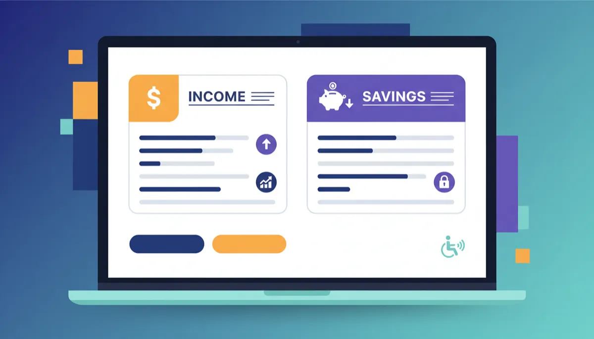
When every field is labeled and read in order, confidence can finally take root.
Accessibility isn’t a ramp bolted onto the side of the building. Done right, it is the building. It’s how you pour the foundation of a financial education that actually includes the students you’ve been saying you want to reach.
From “Not for Me” to “I Already Did It”: The Vision Before Sight Framework
I watched this shift happen in a small after-school group in Oregon. Four students. Ten weeks. Fully virtual. We did the unglamorous things: pick a real savings goal, research an actual financial institution, sort needs from wants with their own money in front of them. Every single student finished. Their confidence didn’t just nudge up; it jumped by more than half.
What changed wasn’t their intelligence. It was the doorway. Once the worksheet read out loud in the right order and the steps didn’t assume a pair of eyes, the money stopped being someone else’s language. It became something they’d already done, not just something they’d been told about.
That’s the Vision Before Sight framework in one sentence: clarity of purpose comes before clarity of circumstance. You don’t wait for perfect conditions—perfect eyesight, perfect worksheet, perfect classroom—to start building. You get clear on where you’re going, and you build the door wide enough for the person to walk through as they are, right now.
How You Can Build a Better Door This Week
You don’t need a certification or a curriculum to start making your family’s money lessons more accessible. You need one honest pass at the doorway. Try this with any worksheet or activity you’re using:
Read it out loud, in order. If a money worksheet doesn’t make sense read top to bottom without pointing at anything, it’s not ready for any kid, sighted or not.
Put the numbers first, then the story. “Needs first, then save, then wants” is a spoken rule before it’s a chart. Teach it as a sentence your child can repeat back, then show how the numbers follow that order.
Never trap the lesson in a picture. If the only place the information lives is an image, half your household can’t reach it. Put the key ideas and steps in text your child can hear, enlarge, or re-read at their own pace.
Start with prevention, not repair. The goal isn’t to fix a credit problem later. It’s to raise a kid who never needs the repair, who learns to build credit without carrying debt and to make money choices from their own values, not whatever the world is selling this week.
The mom who emailed me? Her son finished the Discovery steps. She told me the thing that got him wasn’t a slick app. It was the first worksheet in months that “just talked to him like he could do it.”
He could. He always could. Somebody just finally built the door.
A First Doorway, Ready for You
If you want the version of that first doorway I hand every family—the free Walk With Me Discovery PDF—it’s waiting at financiallygrowing.com/walk. Screen-reader tested, large print, no picture-trapped lessons. Start where you are, with the child in front of you, and a worksheet that was built to meet them there.
I don’t teach money in spite of not seeing the worksheet. I teach it because I finally understand what a worksheet is for: not to impress, but to invite. Not to prove what a student already knows, but to open a door they’ve been told is locked.
“Let your speech always be with grace, as though seasoned with salt, so that you will know how you should respond to each person.”
— Colossians 4:6